HOW TO DISCOVER CUSTOMER EXPERIENCE IN EVERYDAY LIFE #2


Everyday user experiences of Facit employees
In the second part of our series "Customer Experience Moments", we present two negative examples that accompany mobile operating system updates. As always, these experiences are subjective. However, they show even more how strong emotions can be caused by small changes to the user interface of devices.
As in the first part, we want to support you in raising your user and customer experience awareness and encourage you to keep your eyes open in everyday life.
Theresa, Consultant, is really disappointed
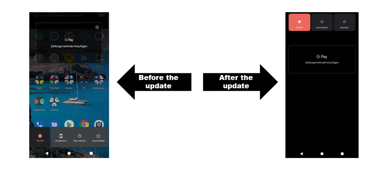
Yes, really! Just a few months ago, I praised the Android operating system in an internal professional exchange among colleagues and presented it as a best practice example in connection with the trend towards "thumb-driven design". All our mobile devices have become more and more extensive in recent years - making it increasingly difficult to use them with one hand. Thumb-driven design is intended to address this development by placing important UI elements, such as the hamburger menu or a tap bar, at the bottom of the screen. This makes them easier to reach with the thumb. After the last update of my smartphone operating system (Google Pixel), however, I had to realize that Android has now said goodbye to the idea again. Some of the elements and buttons that are relevant to me have now been placed at the top (and therefore difficult to reach) of the screen again. Too bad!
Jonas, Junior Consultant, was totally confused at first
Jonas uses the native Sleep app on his iPhone regularly. This way, he is reminded every evening when he should go to bed in order to achieve his desired 7.5 hours of sleep. However, after an iOS update, the alarm layout has now changed, and he finds the new design simply unintuitive.
Before the update, bedtime was displayed in a 12-hour circle, as in an analog clock. Above the circle, the time at which the alarm clock was set was again displayed digitally. Now, after the update, there is only one analog 24-hour clock. Of course, there are 24 hours in a day. Nevertheless, we are used to read a clock and its round circuit with 12 hours. The changed display of the set bedtime initially led to confusion and frustration. At first, Jonas thought the set time was only ¼ of the night. And even though he now understood the display and setting after using it several times, he is still left with a little annoyance about the change in design.
I think it's actually an extremely cool feature, but now I suddenly thought I was only sleeping ¼ of the night
Putting yourself in the user's perspective
Have you experienced a similar frustration after a system update? Have you also felt the anger? Or the disappointment that the operators of the apps or devices did not think of you as a user?
Perhaps you can take this experience with you when you plan changes to your product or service yourself. Our advice is always: ask the users.

Theresa Amberger
As a studied communication scientist Theresa asks many questions and likes to get to the bottom of things, as for example for the blog series "Inside FaDi". In UX Consulting at Facit Digital, she can optimally combine this passion with her interest in digital trends and technological innovations.